 QuickMovie
7 Rules for Readable Video Subtitles
QuickMovie Team · 2026-10-10
The same content can feel very different depending on how subtitles are added. Many people watch with the sound off, so subtitles are not optional but basic. Checking the seven points below avoids most problems.
1. Two lines at most
Three or more lines cover much of the screen and take time to read. If a sentence is long, split it into two subtitles.
2. About 15–20 characters per line
On a vertical screen, a line that is too long makes the text small or cuts it at the edges. Break lines at meaningful units; avoid breaking right before particles or short function words.
3. Leave time to read
A viewer reads roughly 7–10 Korean characters per second (shorter English lines read faster per character). A 20-character subtitle should stay on screen for at least 2–3 seconds. Subtitles that vanish too fast tire viewers out.
4. Match the sound
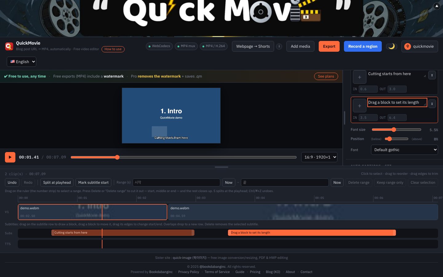
Showing a subtitle just before the voice starts and removing it right after the speech ends feels natural. In QuickMovie you can drag blocks on the subtitle row and set start and end by eye.
5. Contrast between text and background
White text with a dark outline (or the reverse) is the most stable. Avoid text colors close to the background. Dark text on bright scenes and light text on dark scenes is the basic rule.
6. One font
Mixing several fonts in one video looks busy. Use one bold sans-serif for body subtitles and mark emphasis with color or size. Handwriting or highly stylized fonts are best kept for short titles.
7. Stay inside the safe zone
Subtitles at the very bottom are easily hidden by the platform's description or buttons. Raising them 8–15% from the bottom is safer. Also check that they don't cover faces or important objects.
Making subtitles quickly
For talk-heavy video, an automatic transcript (speech recognition) as a first draft and fixing only the errors is the fastest route. If subtitles are already burned into a video, the on-screen text extraction (OCR) feature can pull out the lines. Either way, read them yourself at the end to check typos and line breaks.
How settings change readability
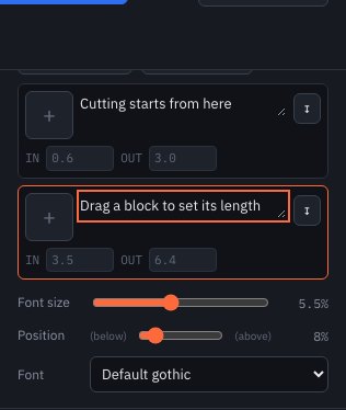
The same sentence reads differently depending on subtitle settings. A smaller size fits more characters on screen but gets hard to read on a phone; a slightly larger size that wraps to two lines is clearer for viewers. Raise the position a little from the bottom edge so the description doesn't cover it. There's no single right answer — shrink your video to phone size and compare.
Checklist
- Turn the sound off and check the video can be followed by subtitles alone.
- Reduce the view to phone size and check the text is legible.
- Check that subtitles don't cover faces or important objects.
- Check typos and spacing once more. Automatic subtitles tend to get proper nouns wrong.
Common mistakes
- Transcribing speech verbatim so filler words stay in
- A subtitle that stays on screen 3+ seconds but contains a single word
- Repeating the same subtitle in several places
This article is based on the actual screens and features of the QuickMovie editor. Platform policies and numbers can change, so check the latest guidance before you upload.